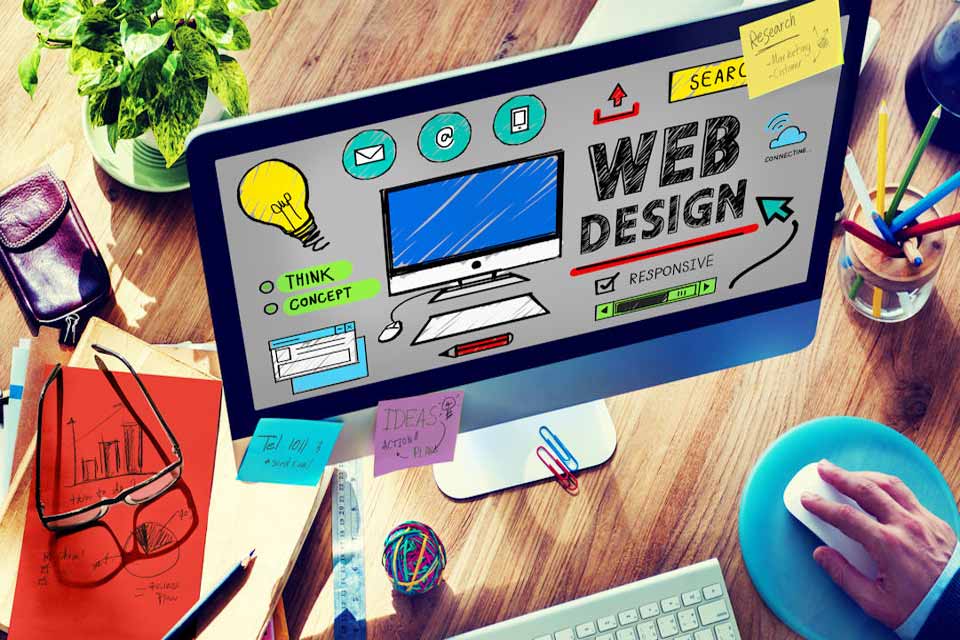
In many cases the web design of yesterday are now thought to be inefficient because they clutter up the website and give visitors so many options that they see leaving the website as an easier option. In 2016, the emphasis is on de-cluttering the look and feel of the website and only offering one or two options.
At the same time, websites must be responsive so that users of touch-screen iPhones and tablets can still access them and do all they want to on the website with their device. According to professional web designers, to achieve this some of the features we have become used to in website design are gradually disappearing or changing to improve the user experience. Here are some tips to help your business succeed with a modern, responsive web design.
Leave out the navigation bar
While many users are used to seeing the navigation bar down the left side of the page, the modern web page omits this. Tests have shown that visitors rarely click on it. They read what is on the first page and if they don’t find what they want, they leave.
A navigation bar is an unwanted distraction when all you need can be placed on that front page. And you can have a full page spread without the navigation bar taking up room. In addition, that extra space often makes the website design pop. It’s like seeing a full page ad in a magazine compared with a three-quarter page ad.
Throw out free stock images
Stock images are the images that everyone uses because they are free. Rather than using those, images that are unique to your website are better. Visuals play an important part in attracting people to a website. If yours are top quality and unique, then you’ll be ahead of the pack. And if you commission them especially then you will be at the top.
Colour your white space
Part of the uncluttered look is to use white space more. This can even guide visitors to where you want them. However, it doesn’t have to be white in colour. It can be coloured space with nothing in it and it will have the same effect, only be more attractive.
Make it simple
One simple change is to use a large font for body text and the text in images. Large text grabs attention and people tend then to also read the smaller text underneath it, even more so when the smaller text is around 18 points and the headline text larger.
Flat vs. Material
The flat design trend is quite common now – flat meaning that design has no shadows or reflections. However, this is being superseded by the now popular Material Design which includes using layering to create some depth on the sides of the design.

